creating a brand identity to help grow their business in metro vancouver

designer & researcher - ethnographic research, personas, participatory workshops, user journey maps, branding
I created a brand identity for China World in order to successfully grow their business in Metro Vancouver by sustaining and expanding their customer base with a team of five people during a 4 month project. We conducted ethnographic studies and proposed several concepts to help create a brand identity for China World. The main tasks I took on in this project were creating the user journey maps, conducting ethnographic research, and helping with the proposal of our design concepts. We used Photoshop, Illustrator, and Sketch during this project.

Food Labelling Concept

Store Signage Concept

Rice Packaging Concept
Digital Presence Concept
We started the project by conducting ethnographic research into China World. This included going to the store in person to observe how the store operates and actually shopping at the store to see what the customer experience was like. We also interviewed the owners of the store to gain insight on what the owners' point of view was and how they thought the store could improve. Based on the research and information collected, we created three different personas shown in Figure 1.
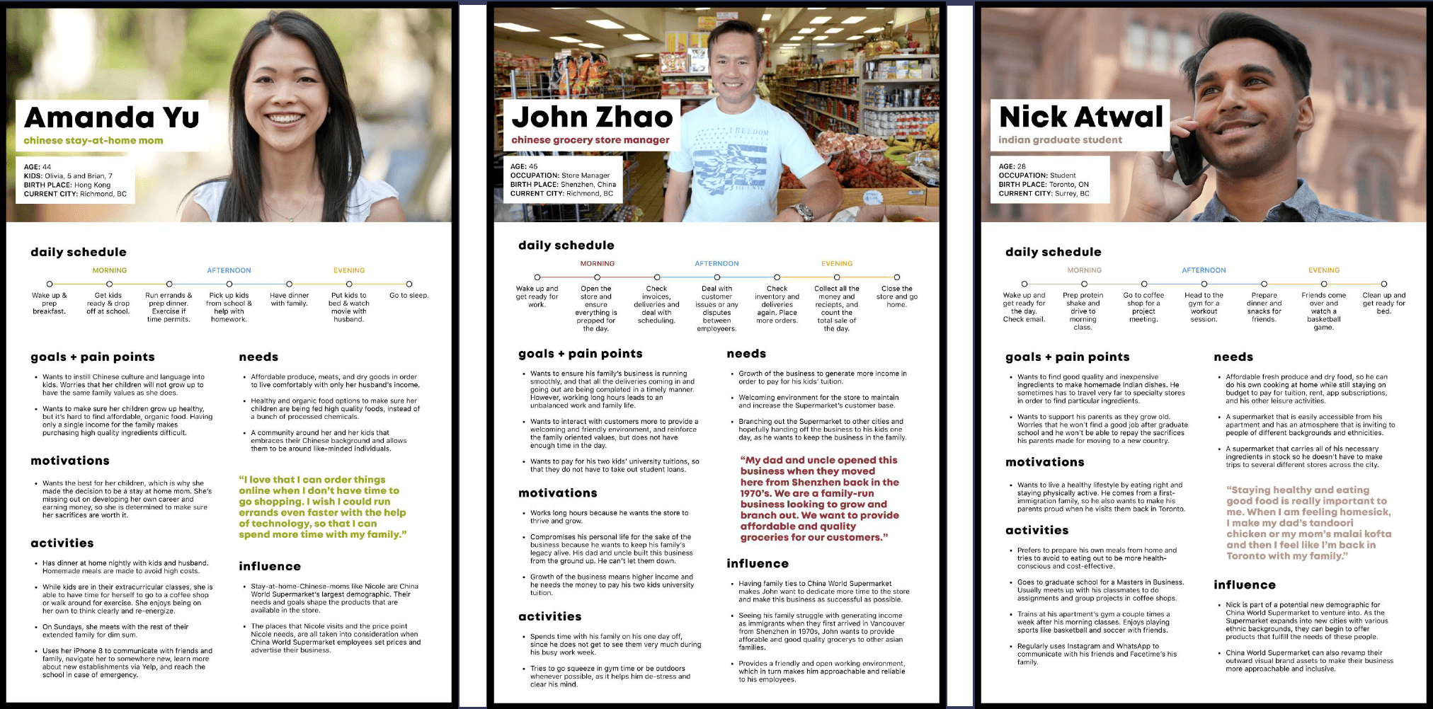
Figure 1: Personas
There were three main takeaways from the personas we created:
1.
Their customers' needs align with China World's goals.
2.
Their customers' values align with China World's values.
3.
There is potential to cater to a variety of customers.
One of the problems we ran into early in the process was narrowing in on a design focus. Many of our initial ideas were focusing on how to improve the in-store experience, but we did not account for the initial touchpoint customers have when seeing China World for the first time. This initial touchpoint determines whether or not customers will continue browsing items at China World. After switching our design focus to creating a stronger brand identity for China World, we were able to propose concepts that not only improved the in-store experience, but also the initial touchpoint customers have with China World.
With the the new design focus in mind, we created a user journey map shown in Figure 2 for how customers initially discover the store and another user journey map for the in-store experience.

Figure 2: User Journey Maps
The key takeaways from the user journey maps we created were:
1.
They had no digital presence (website or social media).
2.
The only advertisement was in a Chinese-only newspaper.
3.
The company has two names: 'China World' and 'Rice World'.
4.
Unclear which locations carry which products, as both carry different products.
5.
Signage is very hard to read (yellow text on white background) and the majority of it is in Chinese.
rice packaging
Based on the key takeaways from our user journey maps and our revised design focus, we proposed several new rice packaging concepts for China World. One of the big issues we addressed with the new packaging was inviting new customers to try and explore different kinds of rice. By offering smaller sizes of rice, customers will be more likely to try different kinds of rice because of the lesser commitment compared to a 20lb bag.
Figure 3: Rice Packaging Concept
food labelling
Our new rice packaging concept can be applied to other areas of the store such as the labelling on products like meats and seafood.
Figure 4: Food Labelling Concept
store signage
This new brand identity can be even further applied to other areas of the store such as banners, aisle names, price tags, and divider bars.
Figure 5: Store Signage Concept
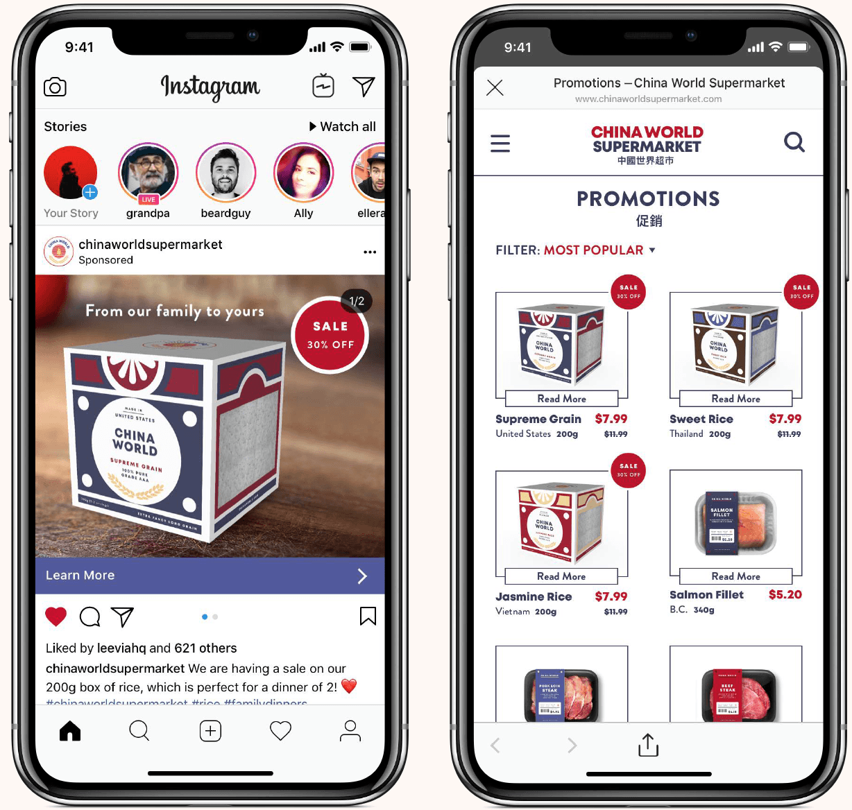
We also proposed a digital strategy using social media. This allows China World to reach a larger audience via online advertisements. They can announce sales and exclusive offers on these platforms, increasing their following and reach. This will also legitimize the business, as they will now have a proper website and locations available on Google and other digital platforms.
Figure 6: Digital Presence Concept
key takeaways
One of the main lessons I took away from this project was the importance of understanding the difference between what a client says they want and what they actually need. Our client initially requested a website to grow their business, but they hadn't considered the importance of the initial touchpoint with potential customers. It's unlikely that customers would find their website by chance. Our proposal addressed this by creating an initial touchpoint that attracts and retains customers, helping the client stand out from their competitors.
© 2024 william dang
made with ceremonial grade matcha and oat milk