improving legibility and usability for internal documents

lead designer - participatory workshops, interviews, surveys, visual design
During my co-op semester at Fraser Health, I was asked to redesign some of their internal documents. One of the issues they said they had with their original documents was that it was difficult to read and use efficiently. Throughout this process, I interviewed multiple stakeholders and conducted a workshop to better understand the problems with the original documents. An example of what their original documents looked like (with information redacted) can be seen below in Figure 1.

Figure 1: Original Document
initial survey findings
To better understand the issues with the document, I created a survey to gather basic information about what the document was used for, how they are usually used, and common pain points that users had. The main findings from the survey was:
1.
Most important pieces of information are: Department, Position, Jobcode, Control ID.
2.
Mainly used to compare Base vs Relief.
3.
Difficult to compare data because it's scattered all over the page.
first iteration
Keeping these findings in mind, I designed a new version of the document. I made sure to keep the Department, Position, Jobcode, and Control ID at the top left of the page for ease of use. In addition, I rearranged the tables to make comparing values easier to do. The first iteration can be seen below in Figure 2.
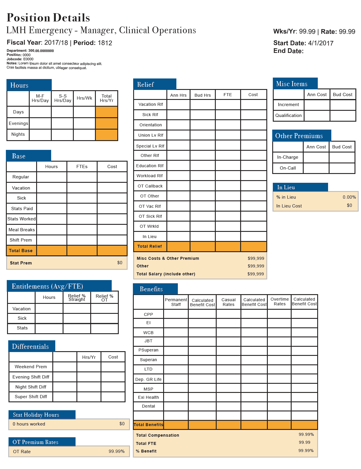
Figure 2: First Iteration
setting up the workshop
To help test the new version of the document and gather more insights, I invited people who would use the documents in any capacity (about 30-40 people) to participate in a workshop. I split them into groups based on how they would use the documents. For example, an accountant might only need to view a specific value, whereas someone in data entry may need to use all the values. By splitting people into groups, I was able to narrow down the needs of each group of users.
participatory workshop findings
The workshop was very helpful to get a first-hand look at how people would actually use the document. I was able to get much more actionable information during this workshop compared to the survey I sent out earlier. These were the key findings from the workshop.
1.
Documents have to be printed out.
2.
Font size for Department, Position, Jobcode, Control ID was too small.
3.
The document had different uses for different people.
4.
A summary section would be helpful for any type of use.
5.
Base vs Relief vs Overtime values are constantly compared.
One of the issues I ran into during this process was handling the needs of the users vs the wants of the client. The client simply wanted to improve the visual design and was not as focused on improving the use of the document itself. The users on the other hand, needed the document to be glanceable and easy to read when comparing values. By conducting the workshop with all the stakeholders present, the client was able to see the user's needs first-hand. This made handling the needs and wants of both stakeholders much easier because both sides were able to see why something needed to be done a certain way.
After the workshop, it was clear that a summary section with all of the important information would be a good addition to the document. I added this in the top right of the page and made it distinct from the rest by using a different colour from the rest of the tables. I also made sure to make comparing values easy for users. In Figure 3 shown below, you can see that I lined up Total Base, Total Relief, and Total OT in one line to make it much easier to quickly compare values; this was an important change I wanted to make for users.

Figure 3: Lining up the tables
before vs after
Here is the final iteration shown side by side next to the original document in Figure 4.

Figure 4: Before & After
key takeaways
The main thing I took away from this project was learning how to work effectively with multiple stakeholders. I had to learn to handle the user's goals and needs with what my client wanted, even if sometimes they were not fully aligned. Communication was vital in this project to ensure both the users' and the client's needs were met.
© 2024 william dang
made with ceremonial grade matcha and oat milk